STEPHENSONS
STEPHENSONS
STEPHENSONS
Created for Stephensons, an established catering equipment supplier, this work encompasses a range of in-house designs. The projects bridge the gap between the company’s heritage and contemporary market needs through refreshed digital and print assets.
Created for Stephensons, an established catering equipment supplier, this work encompasses a range of in-house designs. The projects bridge the gap between the company’s heritage and contemporary market needs through refreshed digital and print assets.
CLIENT
CLIENT
STEPHENSONS
STEPHENSONS
YEAR
2024-2026
Category
Category
IN-HOUSE
IN-HOUSE


BROCHURES
BROCHURES
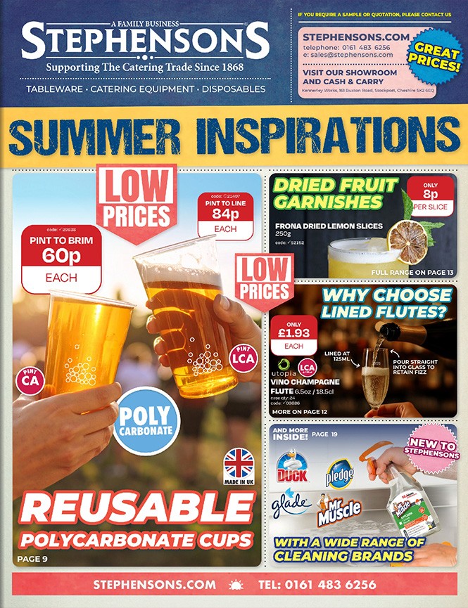
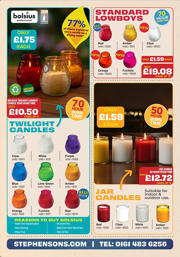
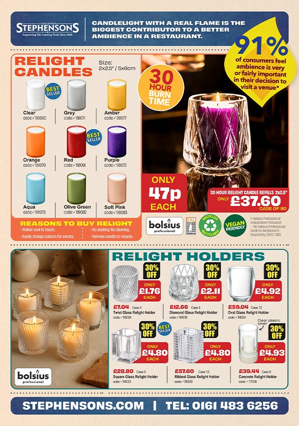
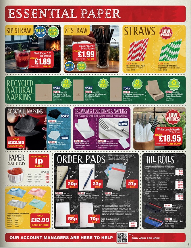
The design of the seasonal brochures required intensive approaches to spatial management, fitting high volumes of product data and imagery into cohesive print formats while maintaining a balanced rhythm and flow across every layout.
The design of the seasonal brochures required intensive approaches to spatial management, fitting high volumes of product data and imagery into cohesive print formats while maintaining a balanced rhythm and flow across every layout.
BROCHURES
The design of the seasonal brochures required intensive approaches to spatial management, fitting high volumes of product data and imagery into cohesive print formats while maintaining a balanced rhythm and flow across every layout.
THE DESIGN
THE DESIGN
The designs are anchored by a rigorous grid system and refined typographic hierarchy. Products are grouped categorically, creating a logical flow that allows for effortless navigation through the catalogue. High-contrast layouts and intentional white space ensure imagery remains the focal point, maintaining a clean aesthetic across the annual brochure book and seasonal newspapers.
The designs are anchored by a rigorous grid system and refined typographic hierarchy. Products are grouped categorically, creating a logical flow that allows for effortless navigation through the catalogue. High-contrast layouts and intentional white space ensure imagery remains the focal point, maintaining a clean aesthetic across the annual brochure book and seasonal newspapers.
THE DESIGN
The designs are anchored by a rigorous grid system and refined typographic hierarchy. Products are grouped categorically, creating a logical flow that allows for effortless navigation through the catalogue. High-contrast layouts and intentional white space ensure imagery remains the focal point, maintaining a clean aesthetic across the annual brochure book and seasonal newspapers.
Tap The Shroud!


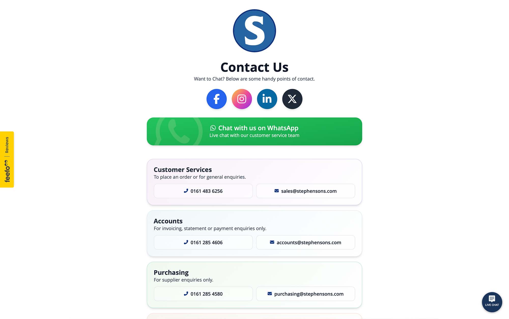
WEB DESIGN
WEB DESIGN
The web design work focused on modernising the Stephensons site through a clean, sophisticated aesthetic. In addition to creating new, fit-for-purpose webpages, many assets across the homepage and mobile site were refreshed to align with the brand’s established tone. By prioritising clarity and intuitive navigation, the updated designs ensure a professional digital experience for a modern B2B customer base.
The web design work focused on modernising the Stephensons site through a clean, sophisticated aesthetic. In addition to creating new, fit-for-purpose webpages, many assets across the homepage and mobile site were refreshed to align with the brand’s established tone. By prioritising clarity and intuitive navigation, the updated designs ensure a professional digital experience for a modern B2B customer base.
WEB DESIGN
The web design work focused on modernising the Stephensons site through a clean, sophisticated aesthetic. In addition to creating new, fit-for-purpose webpages, many assets across the homepage and mobile site were refreshed to align with the brand’s established tone. By prioritising clarity and intuitive navigation, the updated designs ensure a professional digital experience for a modern B2B customer base.
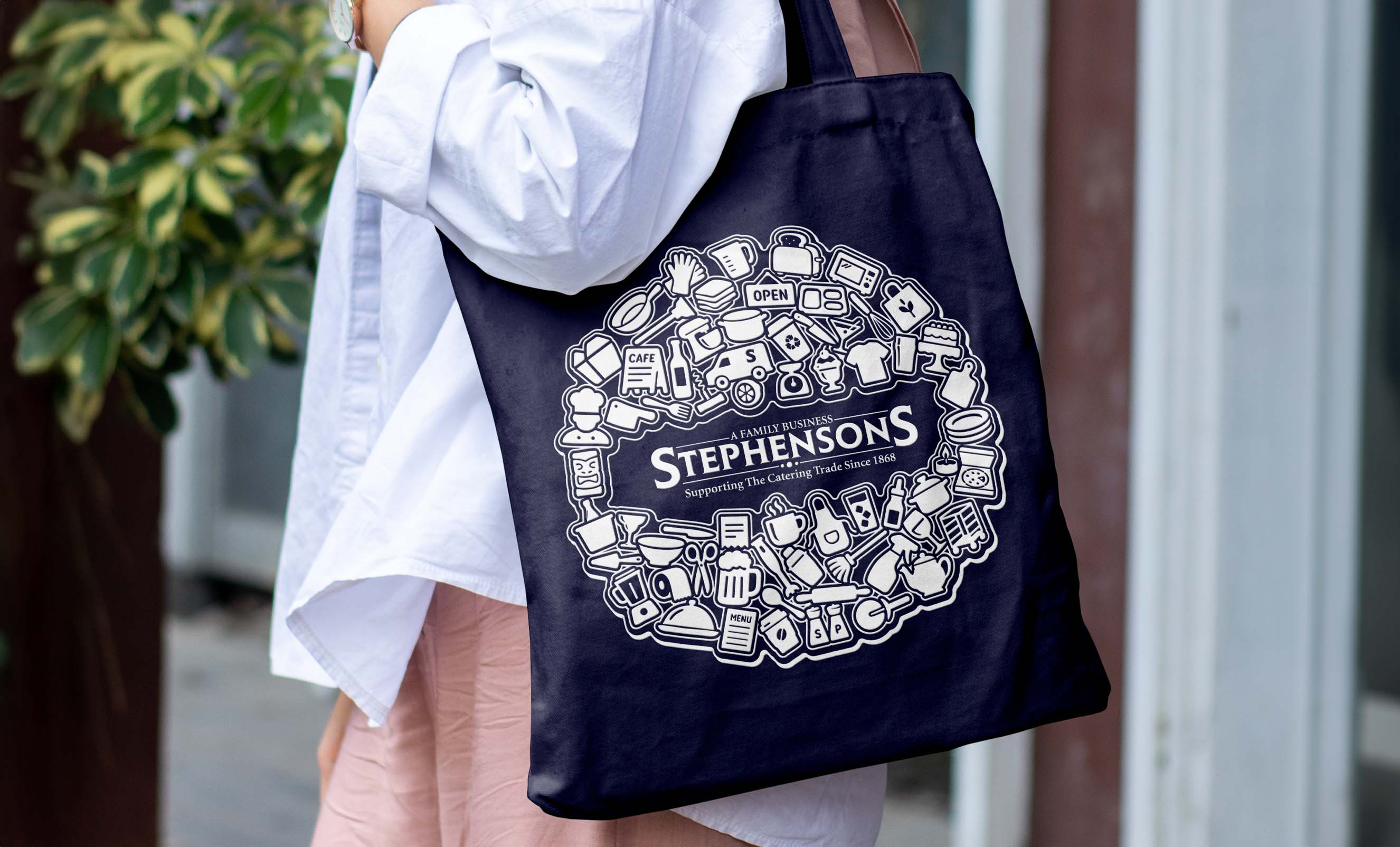
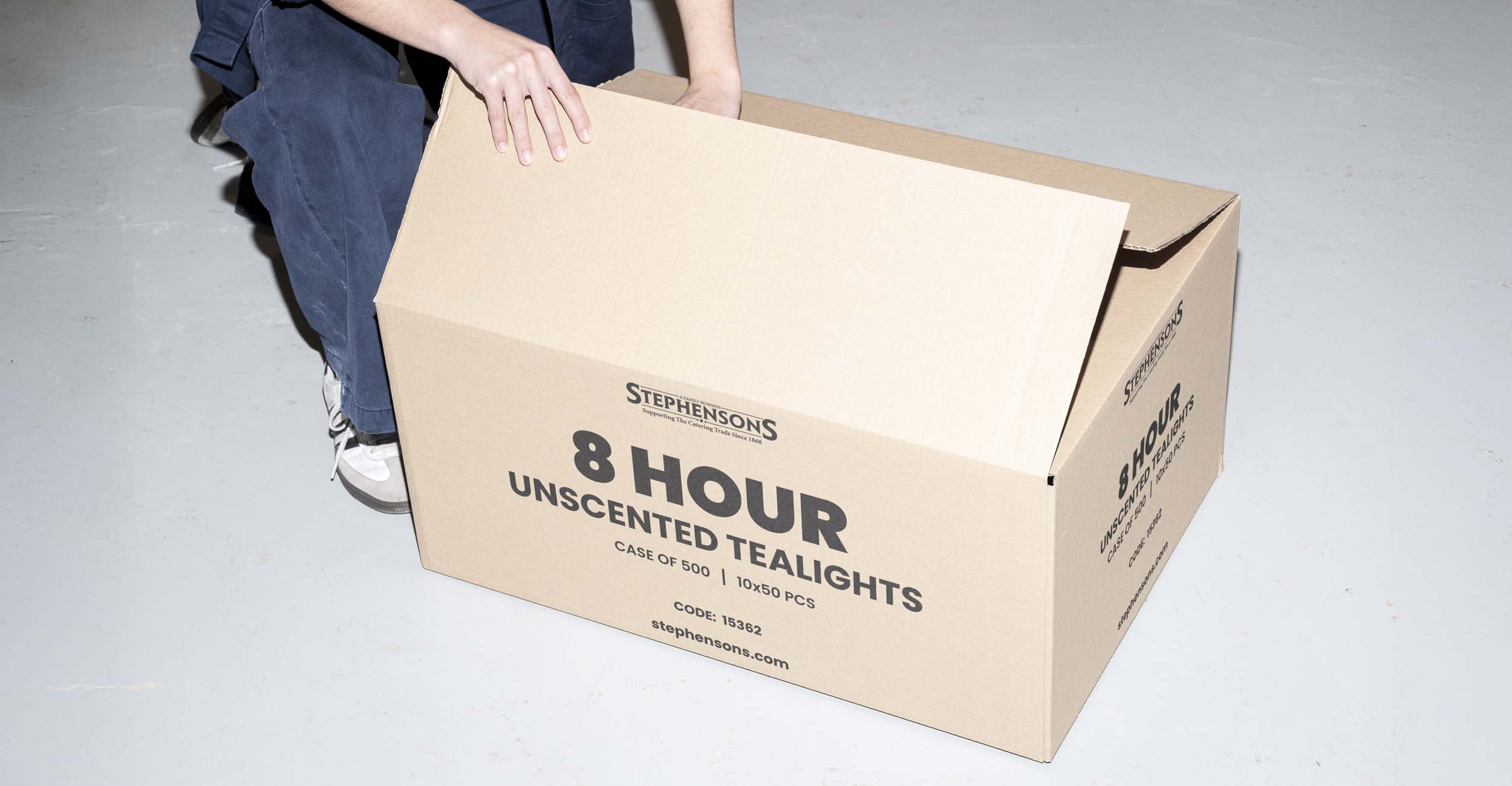
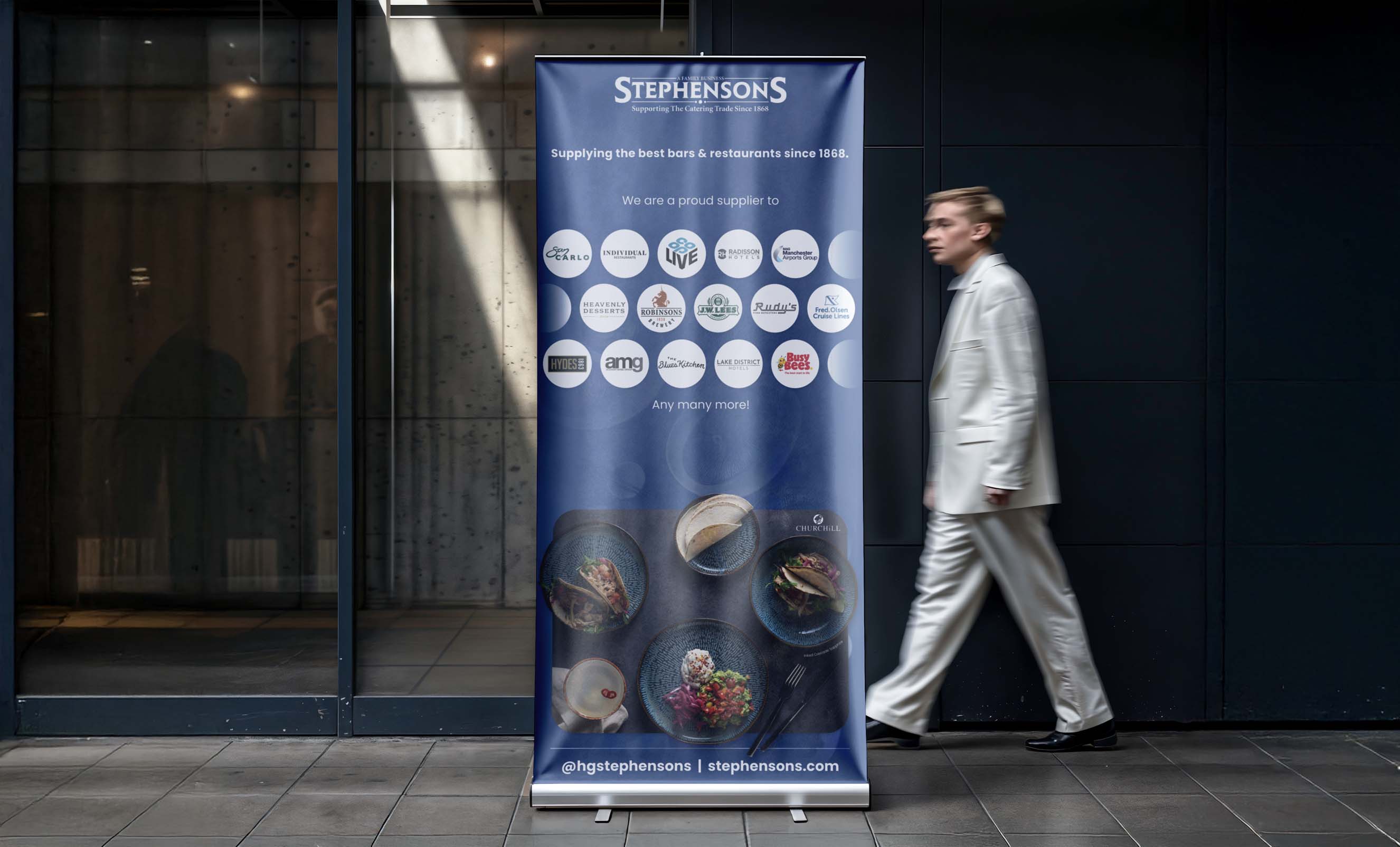
Beyond editorial work, this role involved producing a vast range of physical collateral, including large-scale banners, bespoke packaging, and point-of-sale signage. A key project was the branded tote bag featuring outlined product symbols that represent the breadth of the Stephensons catalogue. These assets prioritise brand consistency and tactile quality to ensure a professional impact within commercial environments.
Beyond editorial work, this role involved producing a vast range of physical collateral, including large-scale banners, bespoke packaging, and point-of-sale signage. A key project was the branded tote bag featuring outlined product symbols that represent the breadth of the Stephensons catalogue. These assets prioritise brand consistency and tactile quality to ensure a professional impact within commercial environments.
Beyond editorial work, this role involved producing a vast range of physical collateral, including large-scale banners, bespoke packaging, and point-of-sale signage. A key project was the branded tote bag featuring outlined product symbols that represent the breadth of the Stephensons catalogue. These assets prioritise brand consistency and tactile quality to ensure a professional impact within commercial environments.