PLAYTIME
PLAYTIME
PLAYTIME
Created for the remaster of Playtime (1967), which explores and satirises the urbanisation of modern life and architecture. The redesigned visual identity captures Jacques Tati’s playful, innovative spirit while remaining relevant to a modern audience.
Created for the remaster of Playtime (1967), which explores and satirises the urbanisation of modern life and architecture. The redesigned visual identity captures Jacques Tati’s playful, innovative spirit while remaining relevant to a modern audience.
PROJECT
PROJECT
UNIVERSITY BRIEF
UNIVERSITY BRIEF
CLIENT
SPIN X MUBI
Category
Category
CAMPAIGN
CAMPAIGN
BRIEF
BRIEF
Inspired by a collaboration with MUBI, this brief required a cohesive campaign across posters, a trailer, and digital assets, as well as creating a bespoke title treatment that functioned effectively in both static and animated formats.
Inspired by a collaboration with MUBI, this brief required a cohesive campaign across posters, a trailer, and digital assets, as well as creating a bespoke title treatment that functioned effectively in both static and animated formats.
BRIEF
Inspired by a collaboration with MUBI, this brief required a cohesive campaign across posters, a trailer, and digital assets, as well as creating a bespoke title treatment that functioned effectively in both static and animated formats.
THE CHALLENGE
THE CHALLENGE
The main challenge was reflecting the film's intricate 'visual wonders' while maintaining a streamlined aesthetic. This required a system that remained conceptually strong while transitioning between a launch poster and a high-paced 60-second trailer.
The main challenge was reflecting the film's intricate 'visual wonders' while maintaining a streamlined aesthetic. This required a system that remained conceptually strong while transitioning between a launch poster and a high-paced 60-second trailer.
THE CHALLENGE
The main challenge was reflecting the film's intricate 'visual wonders' while maintaining a streamlined aesthetic. This required a system that remained conceptually strong while transitioning between a launch poster and a high-paced 60-second trailer.
Tap The Shroud!
CAMPAIGN
CAMPAIGN
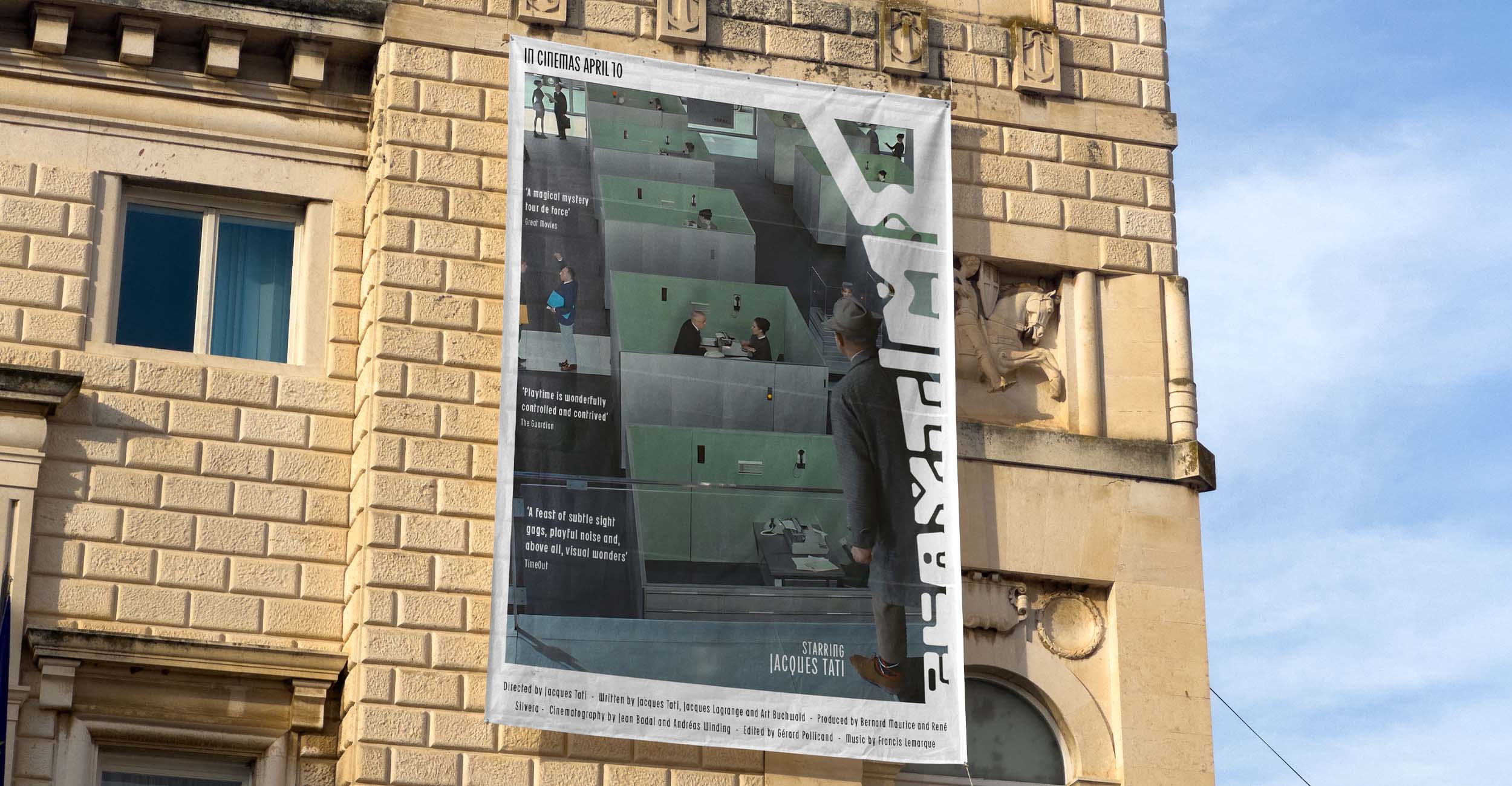
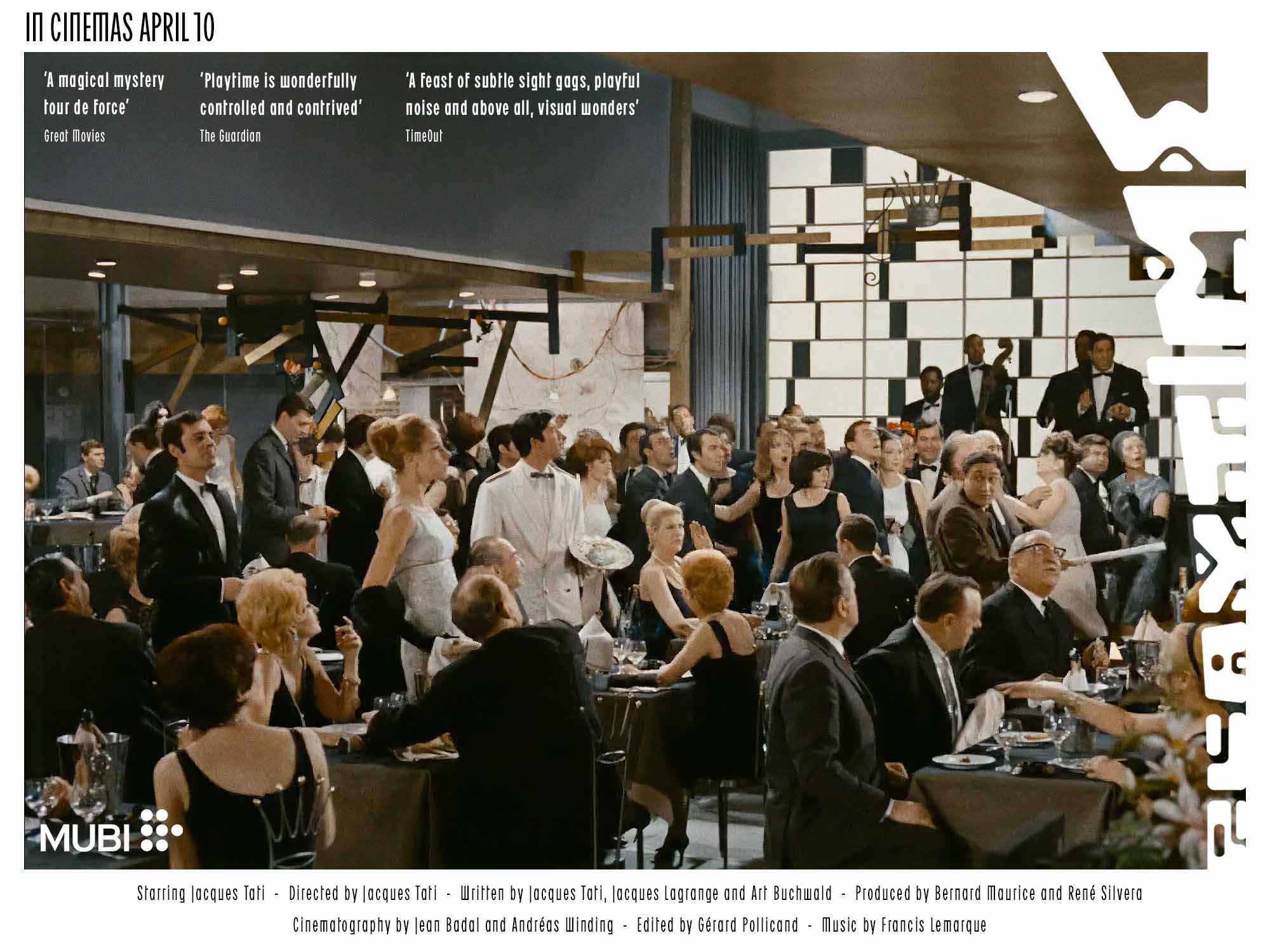
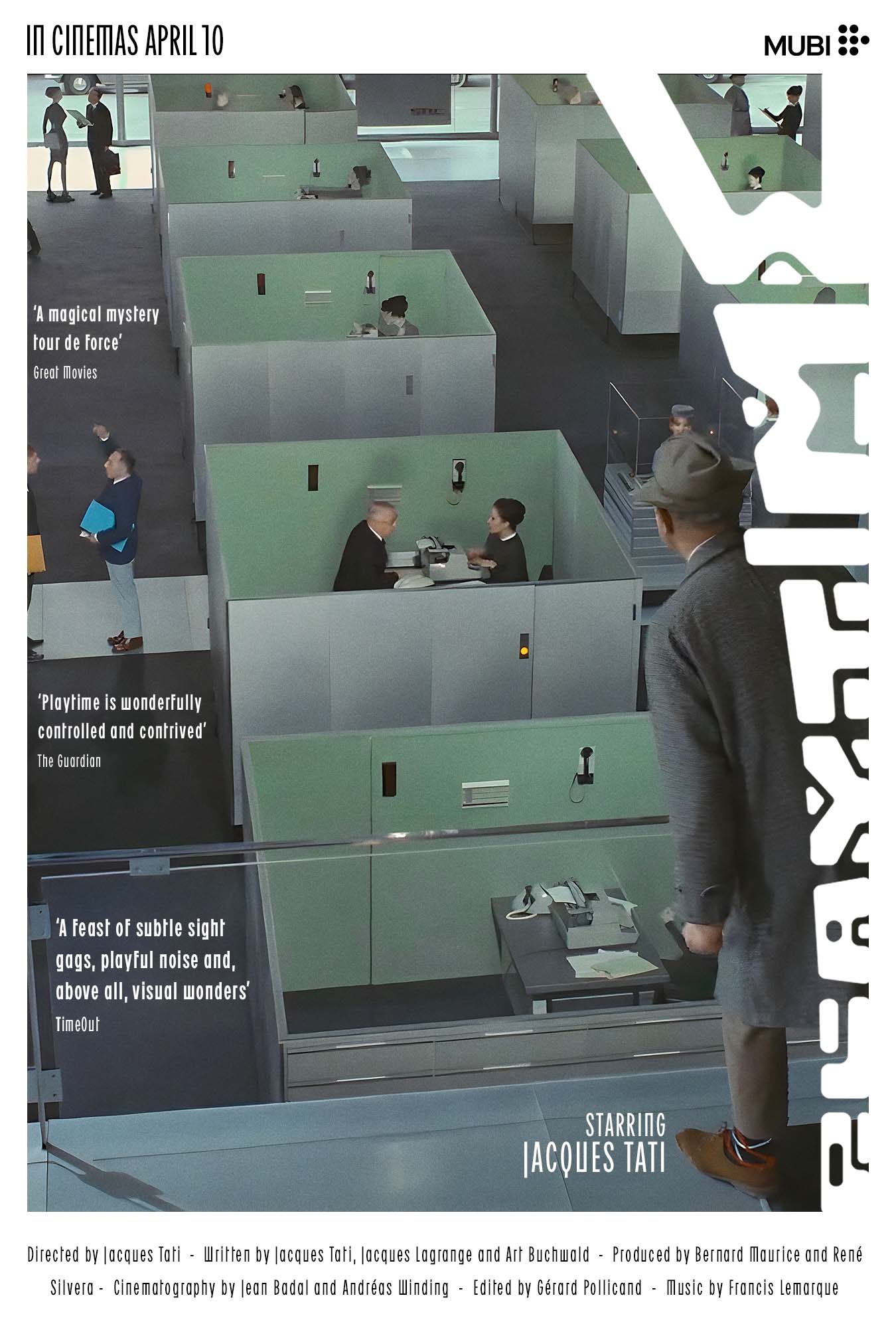
Reflecting the film's central themes, the identity places modern visuals in direct conversation with heritage. The campaign utilises a mix of digital corner billboards and classical buildings to emphasise the contrast between old and new, ensuring the brand's narrative is felt across every touchpoint.
Reflecting the film's central themes, the identity places modern visuals in direct conversation with heritage. The campaign utilises a mix of digital corner billboards and classical buildings to emphasise the contrast between old and new, ensuring the brand's narrative is felt across every touchpoint.
CAMPAIGN
Reflecting the film's central themes, the identity places modern visuals in direct conversation with heritage. The campaign utilises a mix of digital corner billboards and classical buildings to emphasise the contrast between old and new, ensuring the brand's narrative is felt across every touchpoint.
TITLE TREATMENT
TITLE TREATMENT
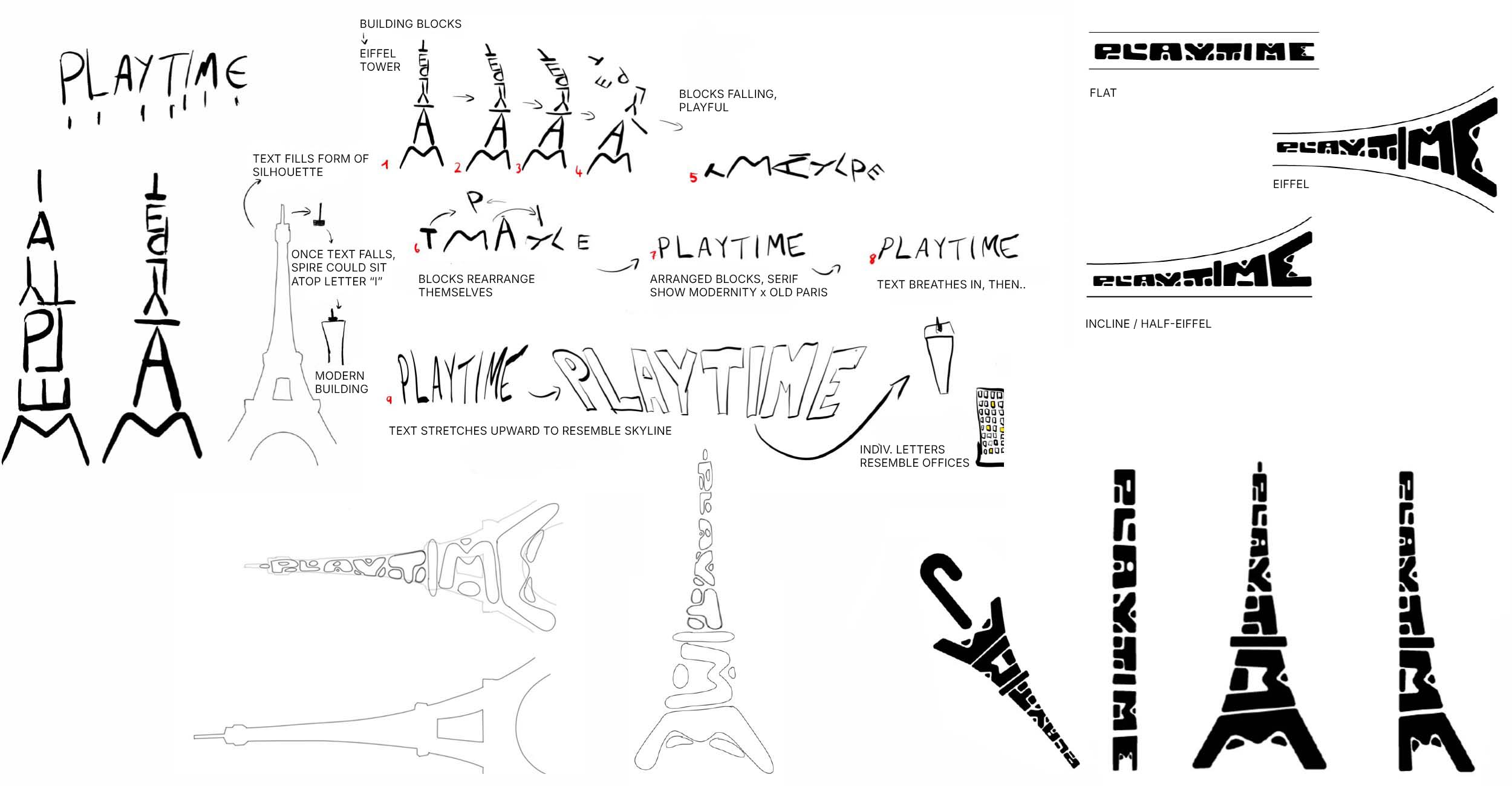
The title treatment features a sideways Eiffel Tower motif to symbolise the conflict between tradition and modernism. The upward-sloping typography reflects urban expansion, while a motion graphic sequence jumbles and resolves letters, transforming the "I" into an office building. This transition serves as a visual commentary on how human moments are boxed in by the rigid grids of modern architecture.
The title treatment features a sideways Eiffel Tower motif to symbolise the conflict between tradition and modernism. The upward-sloping typography reflects urban expansion, while a motion graphic sequence jumbles and resolves letters, transforming the "I" into an office building. This transition serves as a visual commentary on how human moments are boxed in by the rigid grids of modern architecture.
TITLE TREATMENT
The title treatment features a sideways Eiffel Tower motif to symbolise the conflict between tradition and modernism. The upward-sloping typography reflects urban expansion, while a motion graphic sequence jumbles and resolves letters, transforming the "I" into an office building. This transition serves as a visual commentary on how human moments are boxed in by the rigid grids of modern architecture.