ABOMINATION
ABOMINATION
ABOMINATION
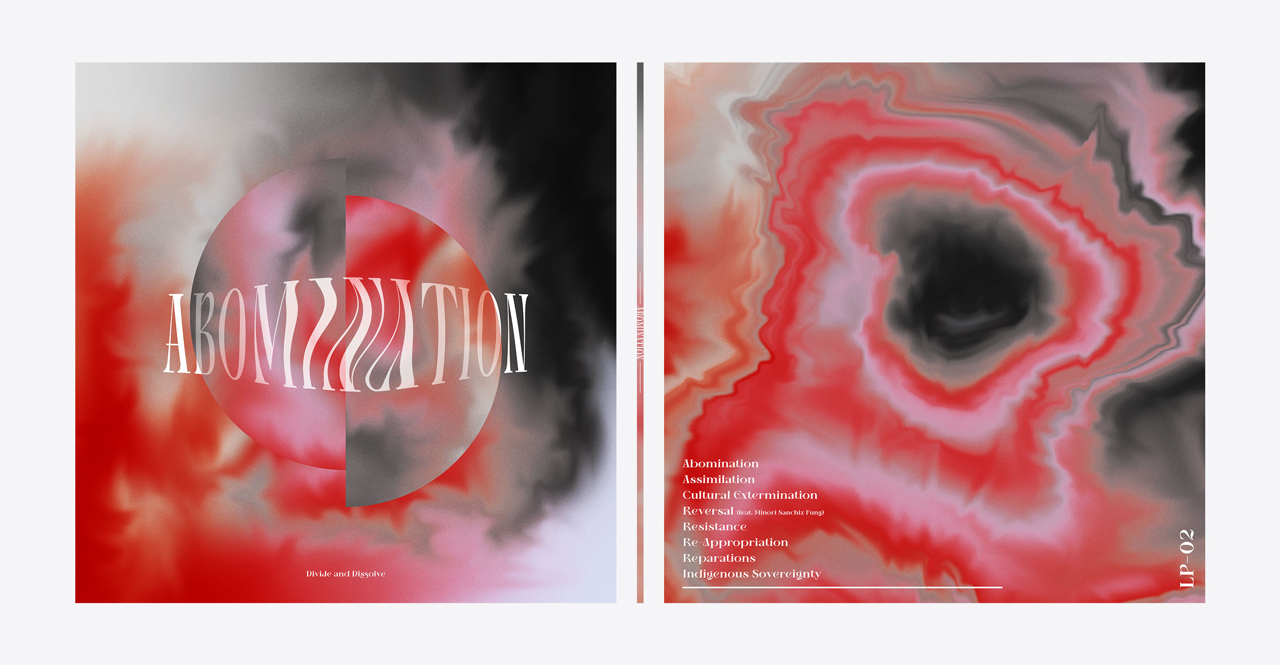
This project reimagines the artwork for Abomination by Divide and Dissolve, translating the band's monolithic "wall of sound" and anti-colonial message into a new visual language.
This project reimagines the artwork for Abomination by Divide and Dissolve, translating the band's monolithic "wall of sound" and anti-colonial message into a new visual language.
PROJECT
PROJECT
UNIVERSITY BRIEF
UNIVERSITY BRIEF
Category
Category
PACKAGING
PACKAGING

BRIEF
BRIEF
The objective of this university brief was to reimagine the visual identity for an existing vinyl release. The challenge lay in translating the band's complex sociopolitical themes and their unique "wall of sound" into a physical package. The design needed to resonate with the heavy, immersive nature of the audio while maintaining a sophisticated aesthetic suitable for a contemporary vinyl market.
The objective of this university brief was to reimagine the visual identity for an existing vinyl release. The challenge lay in translating the band's complex sociopolitical themes and their unique "wall of sound" into a physical package. The design needed to resonate with the heavy, immersive nature of the audio while maintaining a sophisticated aesthetic suitable for a contemporary vinyl market.
BRIEF
The objective of this university brief was to reimagine the visual identity for an existing vinyl release. The challenge lay in translating the band's complex sociopolitical themes and their unique "wall of sound" into a physical package. The design needed to resonate with the heavy, immersive nature of the audio while maintaining a sophisticated aesthetic suitable for a contemporary vinyl market.
Design
Design
The visual identity is built upon a series of watercolour experiments, scanned and digitised to represent the dissolution of colonial structures. This organic process mirrors the band’s intent to break down rigid, oppressive systems, creating fluid textures that bleed and shift across the album sleeve. A distorted serif typeface and a central geodic motif symbolise a core of Indigenous resistance emerging from the atmospheric wall of sound created by the artwork's layered textures.
The visual identity is built upon a series of watercolour experiments, scanned and digitised to represent the dissolution of colonial structures. This organic process mirrors the band’s intent to break down rigid, oppressive systems, creating fluid textures that bleed and shift across the album sleeve. A distorted serif typeface and a central geodic motif symbolise a core of Indigenous resistance emerging from the atmospheric wall of sound created by the artwork's layered textures.
Design
The visual identity is built upon a series of watercolour experiments, scanned and digitised to represent the dissolution of colonial structures. This organic process mirrors the band’s intent to break down rigid, oppressive systems, creating fluid textures that bleed and shift across the album sleeve. A distorted serif typeface and a central geodic motif symbolise a core of Indigenous resistance emerging from the atmospheric wall of sound created by the artwork's layered textures.
Tap The Shroud!